
Suune: Task Management
A Smooth Workflow for Freelance Visual Artists
What Is the Project About
Suune is a project management SaaS designed to help freelance visual artists manage commission-based work. Leveraging the chosen API and open source design system, I led design decisions to improve task visibility, file handoff, and communication between artists and clients.
My Role: Product Designer
As the product designer, I redesigned the UI and user flow to improve task management usability, while enforcing design system for consistency and collaborating closely with developers to ensure feasible implementation.
Impact
Accessibility: +19%
User satisfaction: +14%
Task error rates: -26%
Problem
The original interface was inaccessible and cluttered, making it hard for freelance artists to manage tasks and collaborate efficiently.

😵💫
Solution Overview
The solution focused on creating a more consistent and intuitive experience for users managing their projects by unifying the design system, improving accessibility, and restructuring the UI into clearer sections.


⬇️ Learn more about the project ⬇️
Users Struggled with Accessibility Issues and Cognitive Overload
To understand user pain points, I conducted some testings with potential users, analyzing the insights and main struggles that hurt the user experience.
Insights
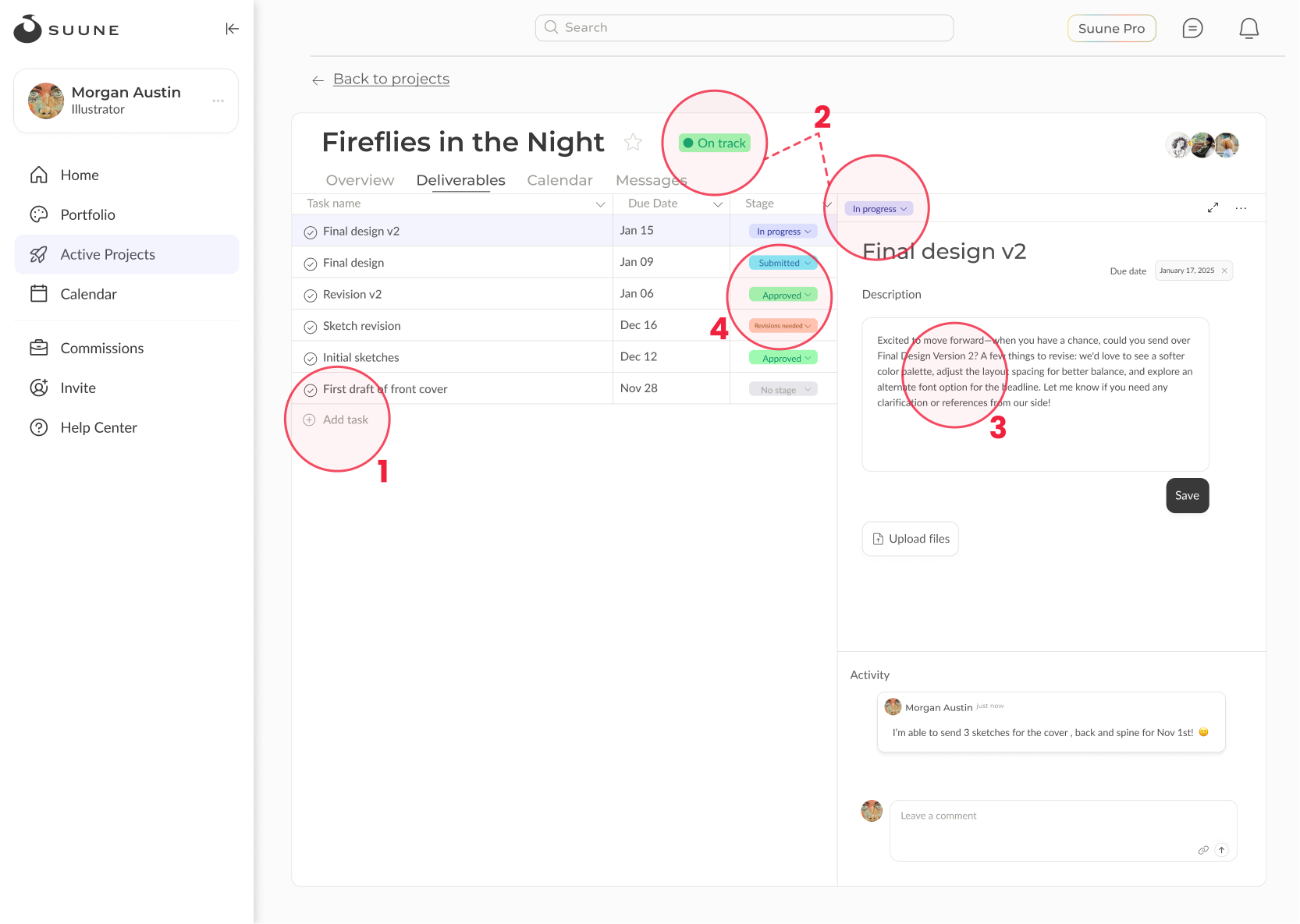
Unclear Call-to-actions
Confusing project status and task stages
Tiny fonts (mostly between 11-13px)
Certain elements lacks color contrast
Various sections in one screen cause cognitive overload
Project Scope and Limitations
The initial MVP for task management includes:
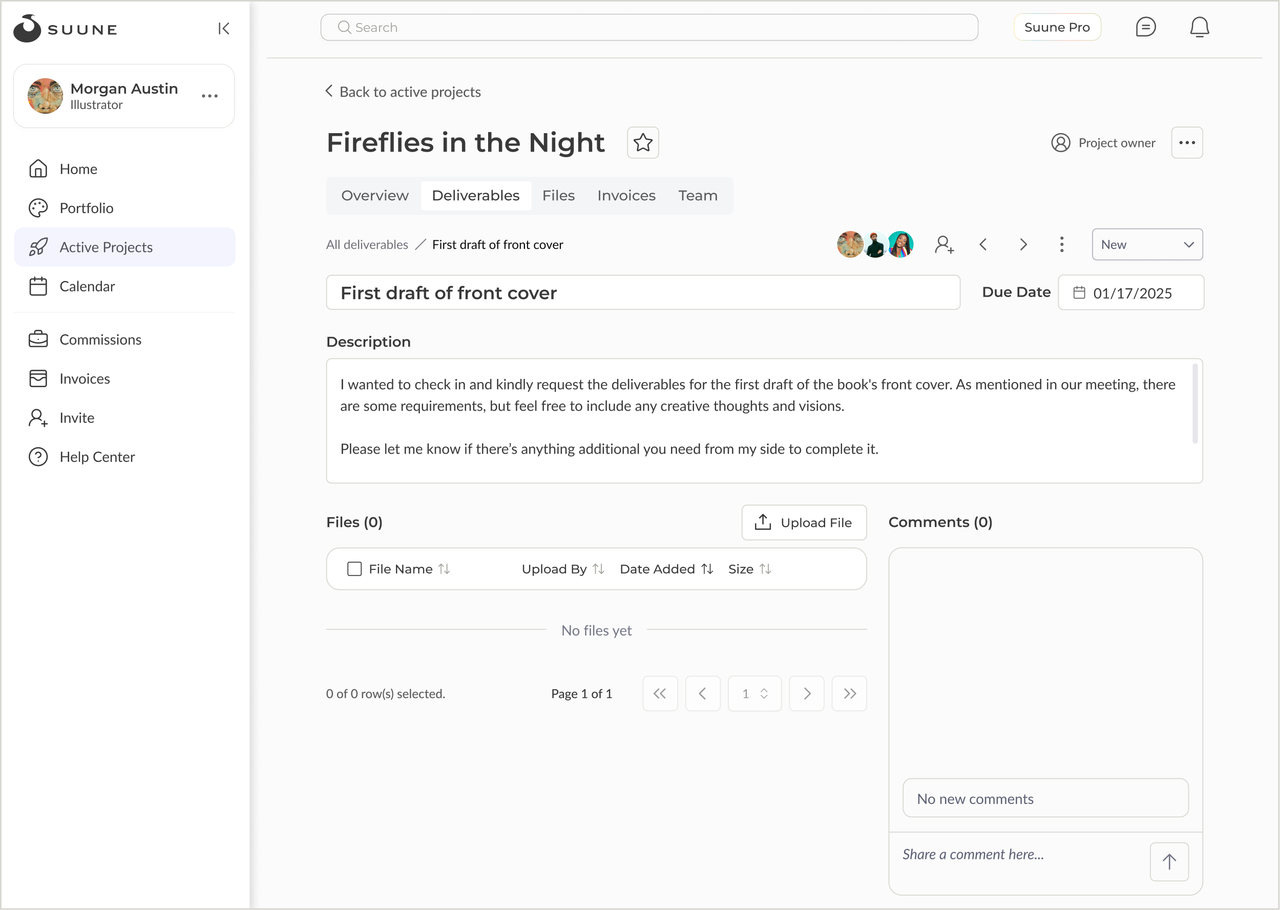
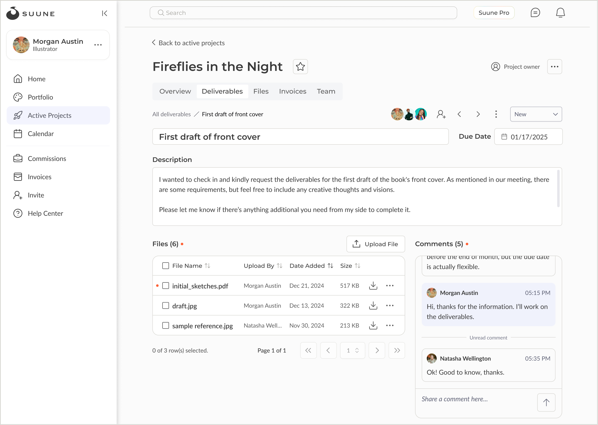
Required: upload files, comment section, invite members, deliverable creation, task details and stages
Good to haves: filters, sorting, pin items, show active profile
More useful features are under considerations for future development
Many features were designed with development feasibility in mind due to limitations from API for backend and design system for frontend
Primarily a web app for desktop
HMW
How might we create a clearer and more accessible UI and workflow that helps artists manage tasks and collaborate more efficiently?
Process Leading to a Clear and Accessible Solution
UI Consistency + Accessibility

While the team was using a design system, it wasn’t consistently implemented. Through meetings and collaborations, I led the team to unify UI elements across the platform. I also ensured the designs were accessible, maintaining WCAG-compliant contrast ratio.
Layout Explorations + Iterations
With the testing insights, I was able to explore potential solutions for a clear layout, improving user experience:
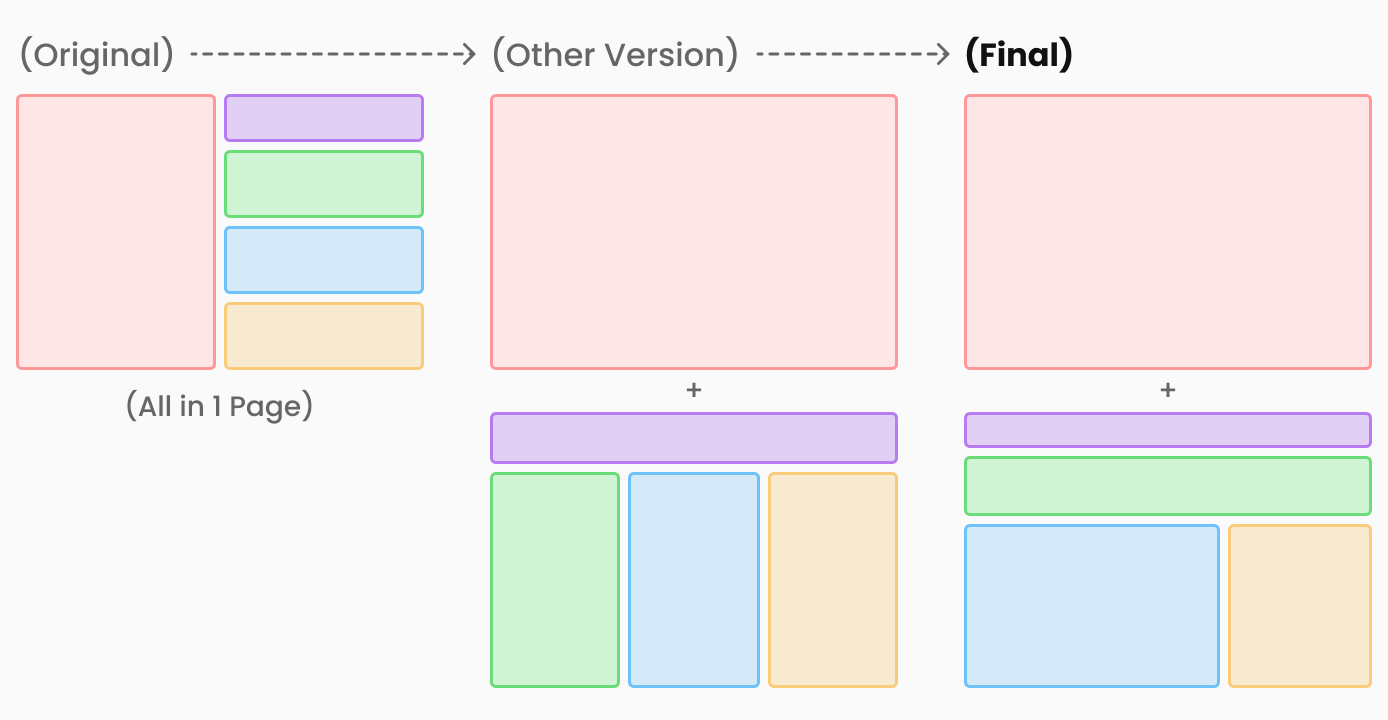
Original: cluttered with all information on one screen
Final: separated content to 2 screens and introduced a bento-style layout, giving more space to key content. This helps artists focus on one section at a time without losing context or feeling overwhelmed.
Advocated Auto-Save Feature and Status Placement for Intuitive User Flows
Auto-Save Feature
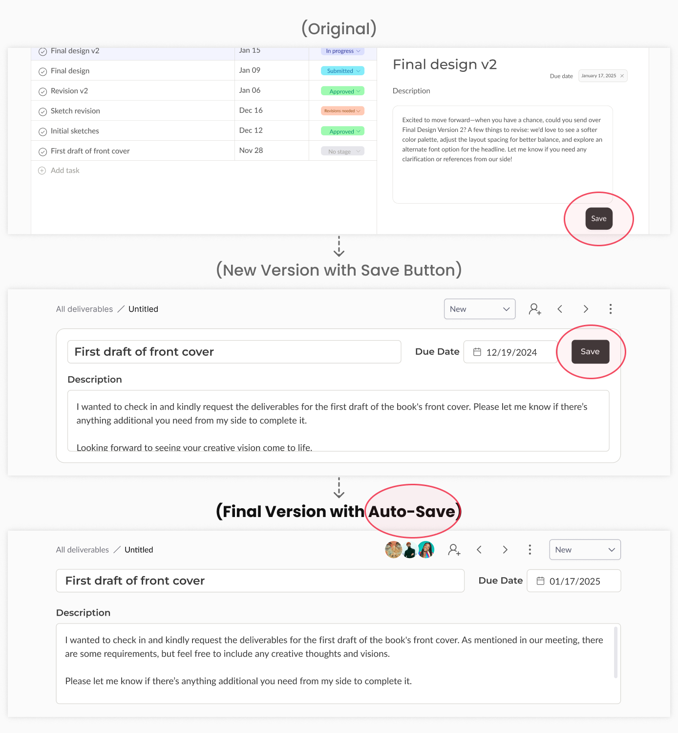
To improve user flow and reduce friction, I advocated the auto-save feature by working closely with the dev team, so users don’t need to keep clicking save button when making changes in deliverable detail page.
Status Placement
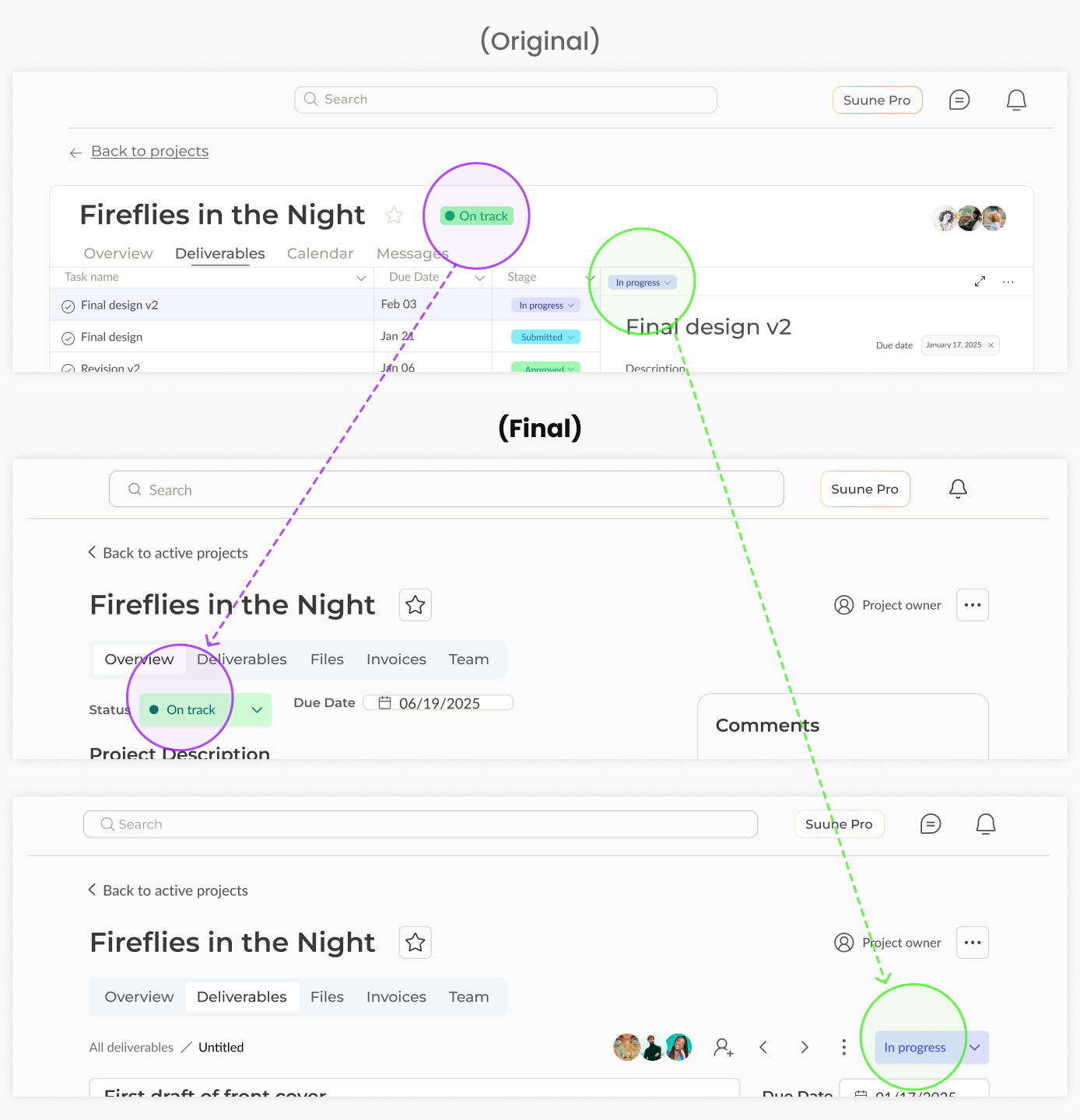
The project status is removed to be only shown in the “Overview” page, avoiding distraction and confusion with the deliverable stages in the detail page.
What I Learned
This project reinforced the importance of close collaboration with engineers. Understanding technical constraints early helped us balance user experience with development feasibility—like when we worked together to implement auto-save instead of relying on manual save buttons.
What’s Next
Design onboarding tutorials for first-time users
Add tooltips to improve clarity for icons and actions
Plan on designing the mobile version
More Projects
Next Project ❯

WUA: Design System
Design an accessible system
❮ Previous Project
SuPaw Nova App
Smart Pet Behavior Analysis