
Water Utility App: Accessible Design System
Design an Accessible System
My Role
UX Designer (UI/UX, Design System Lead)
Impact
User satisfaction: +11%
Handoff time: -21%
UI inconsistency: -63%
Timeline
Dec 2024 - Feb 2025
What Is the Project About
Water Utility App helps communities stay informed about water outages, reported issues, and water conservation content. At KeelWorks Foundation, I’ve built a unified and accessible design system.
Problem
Early mockups lacked consistency in style and elements, which lead to confusing interactions and unpredictable UI patterns, especially for users who were unfamiliar with digital experience.
My Responsibility and Process
In addition to onboarding flows and landing screens, I oversaw the design system with the challenges of unifying the design across various devices and ensure the system is accessible and intuitive for users with low digital proficiency.
Target Audience
Primary TA: Low-digital-proficiency individuals who live in areas with limited access to technology, information, and real-time notifications.
Secondary TA: Designers and developers in the same team for smoother handoff.
The app lacked a unified design system, leading to inconsistent styles and poor user experiences, especially for users with limited digital experience.
Project Scope and Limitations
Since users with low digital proficiency are more likely to abandon tools they can’t quickly understand, clarity and usability are crucial, so the design system prioritizes:
Consistency across various devices (though we initially focused on mobile)
Accessibility for low digital proficiency
Simplicity and clarity without sacrificing usability and visuals
Design Limitations
Designing with a compact frame (320px in width) for responsiveness to support various devices, while maintaining breathing room for readability.
Choosing simple UI patterns over decorative elements to reduce cognitive load.
Despite the challenges, these constraints helped ensure the design was approachable even for new smartphone users.
Analyzing Accessible Design Elements
While there were constraints on conducting direct user research due to limited resources, I focused on secondary research around accessibility standards and design practices tailored for low-digital-proficiency users.
Based on the research and our target audience, I was able to conclude below insights and design decisions, identifying the most suitable design elements for our product.
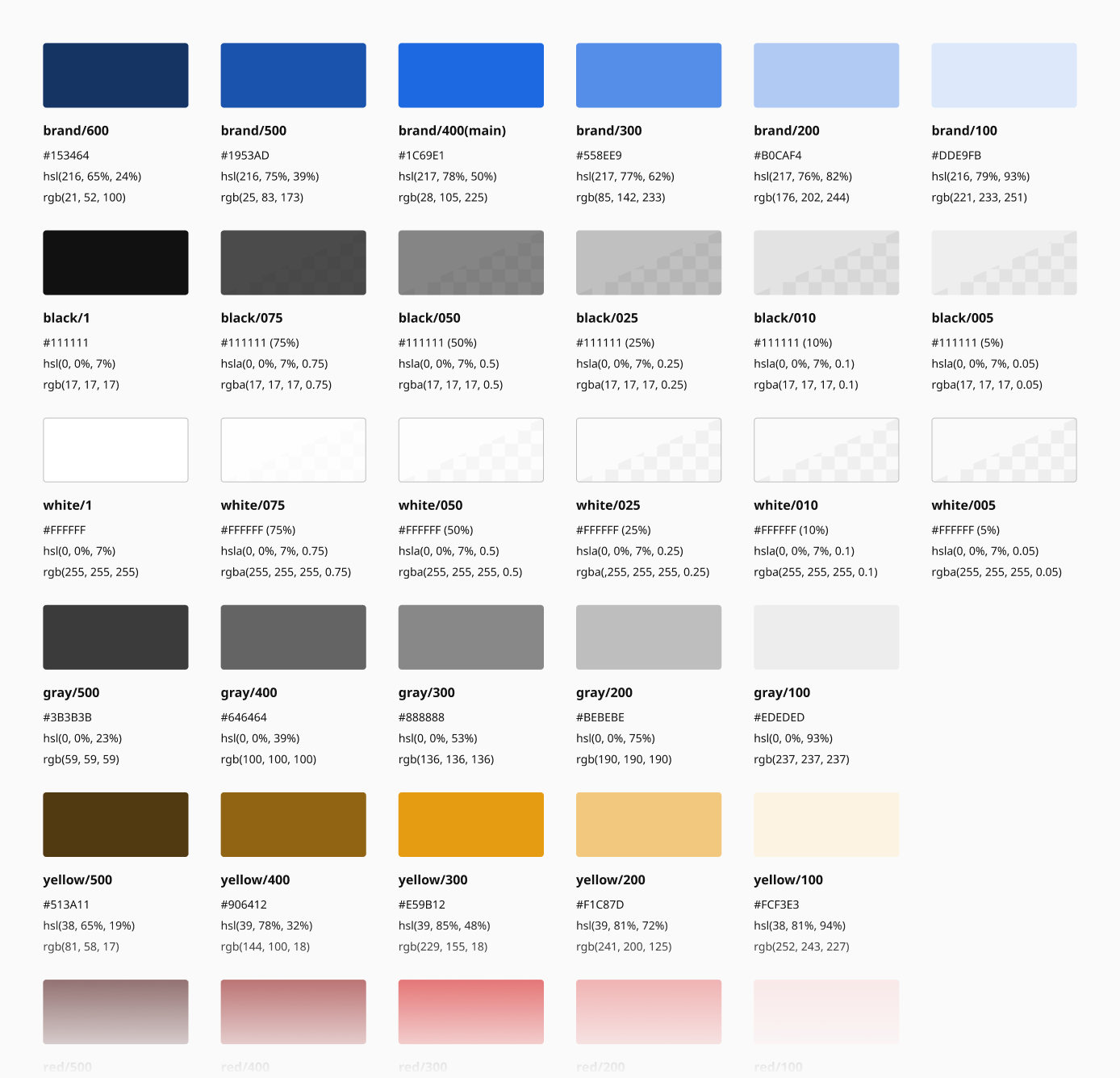
Typography:
Noto Sans

Readable and distinguishable characters (e.g., "i", "l", "1")
Widely used and compatible across various browsers
Versatile font-weights
Color:
Practical Blue

Traditional color theme to set the tone for trust and service
WCAG-compliant contrast levels to ensure visibility in varying lighting conditions and for a wide range of users
Icons:
Phosphor Icons
Clear and versatile
Differentiate active states with outlined and filled icons for visual-impaired users
Add descriptive text for clarity to avoid relying only on visuals
Designing with Variables and Variants

With the insights and decisions from research, I set up colors, typography and created components in Figma using variables and variants, mapping out a unified and simple design system, which prioritized legibility and clarity over trends.
Typography

To be readable and accessible, the body text is set to 16px (1rem) with a smaller text to 14px (0.875rem) for supportive information, and the smallest text to 12px (0.75rem), which is carefully used for trivial information.
Colors

To comply with WCAG, I tested and paired up colors with contrast radio that is at least 4.5:1 for any texts.

I also applied semantic naming to ensure a smooth communication and handoff between design and development teams.
UI Components
Besides common UI elements (e.g., buttons, inputs, selections, etc.), I also created components that are crucial to Water Utility App, such as alert notifications, bar charts and date/time pickers.
Interactive Elements

Interactive elements are designed with accessible contrast ratios and a minimum tap area (>44px in width and height) in mind, so users can easily interact with the app.
Note: According to WCAG, non-interactive components (e.g., disabled controls) are not required to meet contrast requirements.
Alert Notifications

One of the notification types is informing users about water services, including outage alert, running water, maintenance and etc.
Bar Charts

Bar charts display the amount of water each household has used during a period of time. Users can track their usage and adjust their water consumption accordingly.
Charts are also responsive for desktop view.
Date and Time Pickers


The pickers are clear, easy ways to select date and time, mainly used for scheduling a reminder or repair.
What I Learned From the Project
Designing this system wasn’t just about visual consistency, it was also about building trust for users who may be unfamiliar with digital products. By focusing on accessibility, clarity, and cohesion, I’ve learned:
Icons might not be enough: Users with visual impairments or cognitive challenges benefit from text labels
Semantic naming matters: Tokenizing styles helps keep everything scalable and developer-friendly
Next Steps to Continue Improving User Experience
While most elements can translate responsively, some components need to be refined and tailored for desktop to better support different screens.
Continue documenting to support new designers and developers onboarding into the system.
Resources
More Projects
Next Project ❯
Catador
Game UI and HUD design
❮ Previous Project

Suune Web App
Design a seamless and accessible task management SaaS